Structure
Consult
.

Building the foundations
.
Structure consult came in looking for a fresh new look after out growing their original branding. The brief was clear, they wanted something that was professional but also approachable and to incorporate some form of logo mark to differentiate themselves from other firms in the industry where it is predominantly word marks.


Trust in the process
.


Putting a new face to the name
.
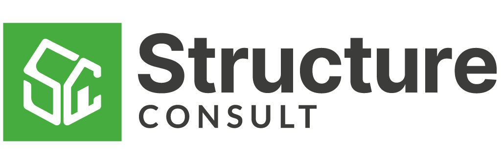
All of the initial concepts featured a logo mark each with their own unique spin on housing or construction. After the first review it became clear we looking towards a monogram style mark the featured both the ‘S’ and the ‘C’ from the company name. We then arrived at selected design feature both letters in an arrangement to symbolise a house.
The final result is simple yet impactful, making use curved soft lines in a clean cut box to communicate the professional but approachable feel the client was looking for. Along with the logo a basic brand guidelines, hoarding boards and business cards were among the final deliverables for the project.


All rights reserved.